HBO Max: RE-imagined
How simplifying the users' decision-making process could lead to a more personalized streaming experience and better content strategy.

The background
Created in 2020 and updated in 2022, this project was intended to redesign the original HBO Max TV and mobile apps when they were first introduced to the market.
Roles
UX design / UX research / Wireframes / UI design
The PROBLEM
HBO Max is a streaming service which features original HBO content, TV series, blockbuster movies, podcasts, and children's entertainment. Priced at $14.99/mo, HBO Max is available as TV, web, and mobile applications.
The HBO Max TV app/website needed an overhaul in visuals and navigation. The current design required more time to navigate, and did not showcase content effectively.
Who’s using HBO Max?
With its extensive library of classic and original shows and movies, such as Friends and Insecure, Statista predicted in 2020 that HBO Max users would most likely be Generation X and Millennials.
the user persona
After conducting research, I decided to center the streaming experience around the primary user demographic, with the intention of creating a more intuitive and personalized streaming experience.
HBO Max User Persona
the user journey
After conducting interviews, I concluded that HBO Max users struggled with navigating through both the TV and mobile apps due to the amount of content being offered and how they were presented.
By dividing the content into “libraries", and allowing users to select their desired category (movie/TV/podcast), we might be able to help users feel less overwhelmed, while personalizing their viewing experience according to their interests.
HBO Max User Journey
Most users wanted to be able to spend less time accessing content, and would typically default to their favorite shows and movies if presented with too many choices.
How might we simplify the users’ decision-making process?
Reorganizing content: Less scrolling, more watching
At the time of this project, HBO Max were showcasing their content based on Most Popular, New Content, Genres, and Categories. These content were presented in no particular order, which forced users to spend a significant amount of time scrolling and ultimately led to decision fatigue.
With the “library” style structure, my goals were as follow:
Easy access to different categories: TV, movies, podcasts, etc.
Quick navigation through the content
Better promotions of HBO Max original and popular content
Curating content based on users’ interests and patterns of selections
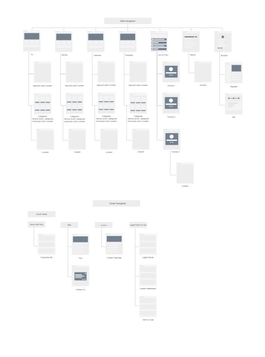
HBO Max redesigned sitemap
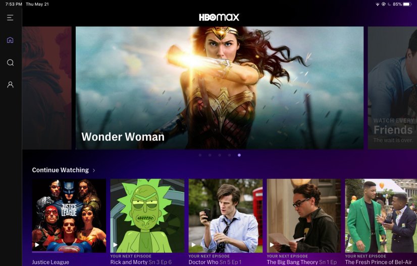
Original home screen: What is missing?
The menu in the original home screen consisted of icons: saved space, but required more time for users to digest what each icon symbolized
The categories were not visible: require users to search for their preferred content
Search and Profile were located in the menu: did not highlight their purposes
Carousel merely showed images of promoted content and did not offer any descriptions or call-to-actions: users were left not knowing if these content were clickable or worth exploring
HBO Max original home screen
Updated home screen: Small changes, big difference!
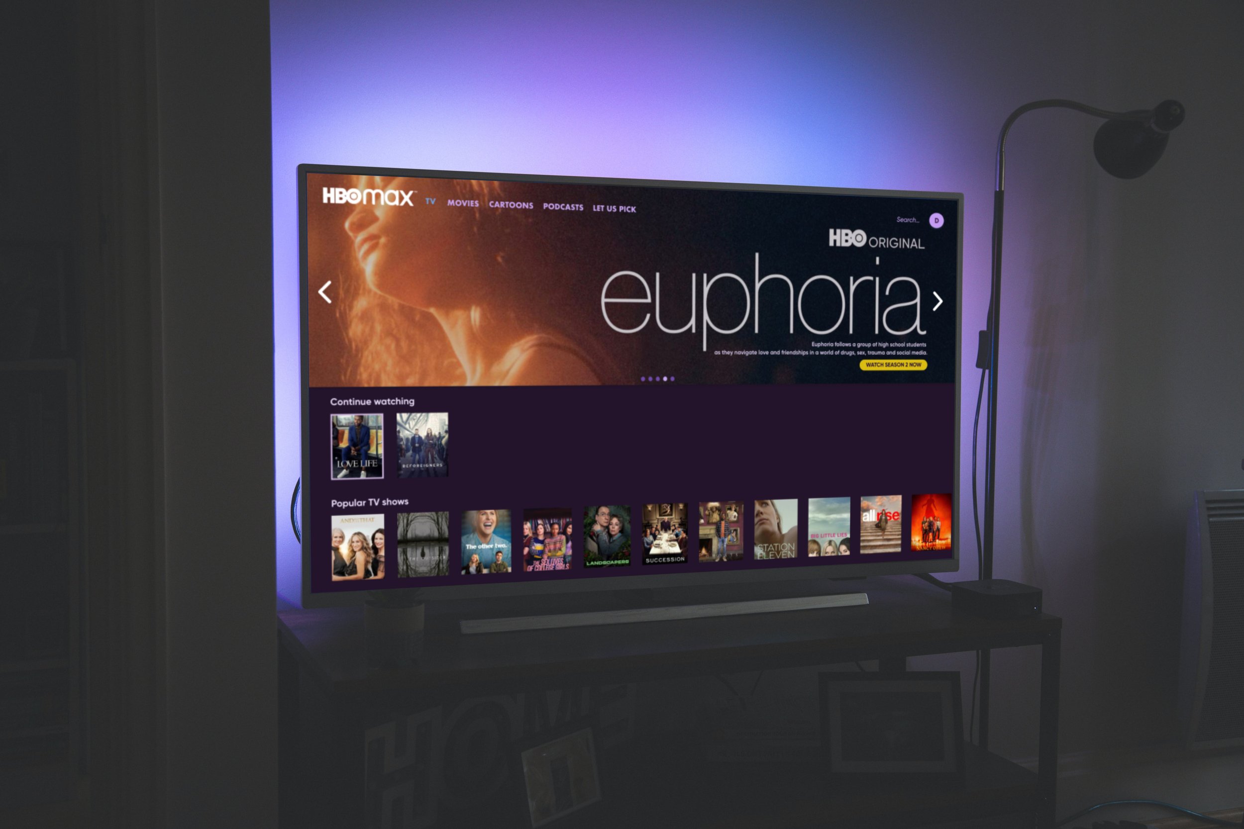
Replacing menu icons with words: words provide more clarity, which can lead to faster decision-making
“Category-first" Menu: users can navigate through HBO Max’s extensive library without spending a lot of time scrolling/searching for their preferred content
Separating Search and Profile from Menu: better distinguish their functions
Enlarged hero videos + descriptions + autoplay: promoted content is boldly highlighted with clear call-to-actions, is enticing to the eye, and encourages users to explore without having to manually click “Play"
HBO Max redesigned home screen
INTRODUCING:
LET us pick
let us pick: Engage users by “gamifying” the decision-making process
Introducing LET US PICK: Using the information collected from users’ viewing history, HBO Max could suggest content by presenting different topics or themes that users could choose from. By “gamifying" the users' decision-making process, HBO Max could further personalize users' viewing experience, while making the app more interactive.
New feature: LET US PICK
The new mobile experience
Following the redesign of the TV app, I made 3 major design updates to the HBO Max mobile app:
Highlighting the Categories: I extracted the Categories from the Menu to help users navigate through the content library more efficiently.
Removing the Menu: I separated the menu items and moved them to the bottom navigation, making them more accessible. Users can easily search for titles, view their saved content, download their favorite shows and movies, and update their profiles.
Interjecting the infinite scroll with Promoted Content: Similar to ad breaks, adding clickable hero videos with clear call-to-actions is an engaging way to promote new content.
Original HBO Max mobile app
Redesigned HBO Max mobile app
the results
IN summary, these were the design updates I made to the HBO Max app:
Reorganize content by “Categories” to help users arrive at their desired content quickly
Implementing autoplay, descriptions, and call-to-actions to invite users to explore content
Engage and assist users during their decision-making process by adding LET US PICK feature


